

Making Mobile Money Movement Easier to Navigate
How I mapped where money came from and where it needed to go to decide what investors should see before choosing a transaction.
Read Time: Summary 2-3 Min / Deep Dive 3-5 Min
When customers had a retirement rollover check, Deposit seemed like the obvious choice. In the app, that choice could lead to an unexpected endorsement request. Some customers got stuck and called for help. The design question was which choices belonged on the landing page and which could wait until the app knew more about the transaction.
Role
UX Strategist, XD Mobile Lab Lead
Org
Investment Firm
Timeline
Apr 2023 – Oct 2023
Executive Snapshot
Initial Request
Reduce misclassified deposits. The menu asked customers to classify the money they were moving using the firm's terminology.
Design Decision
Make common actions easier to find and explore how the source and destination could guide customers to the appropriate flow.
What We Tested
A redesigned landing screen in 2023 grouped related actions and surfaced mobile check deposit guidance before customers chose an action.
Role
As UX Strategist and XD Mobile Lab Lead, I mapped transaction scenarios and translated them into wireframes and prototypes for the mobile experience.
This case study covers my 2023 work on mobile money movement at an investment firm. My work as UX Strategist and XD Mobile Lab Lead initially covered advice services and later expanded to transactions and money movement. I reconstructed this case study from project discussions and retained design materials.
Strategic Signals
| Focus | How it showed up |
|---|---|
| Research and analytics | Analytics identified drop-off at the transaction landing page. Operations reports showed how the rollover path could lead to a support call. |
| Information architecture and interaction design | I mapped how transaction wording, source and destination accounts, and account eligibility affected the path a customer needed. |
| Delivery tradeoff | The team explored a clearer mobile entry that could connect to existing transaction flows while bigger changes remained constrained. |
| Business goal | Help customers complete routine transactions on their own and reduce the support and correction work that can follow a wrong turn. |
What Changed
| Original experience | Design we tested |
|---|---|
Deposit, Withdraw, Contribute, and Rollover appeared in a stacked list. 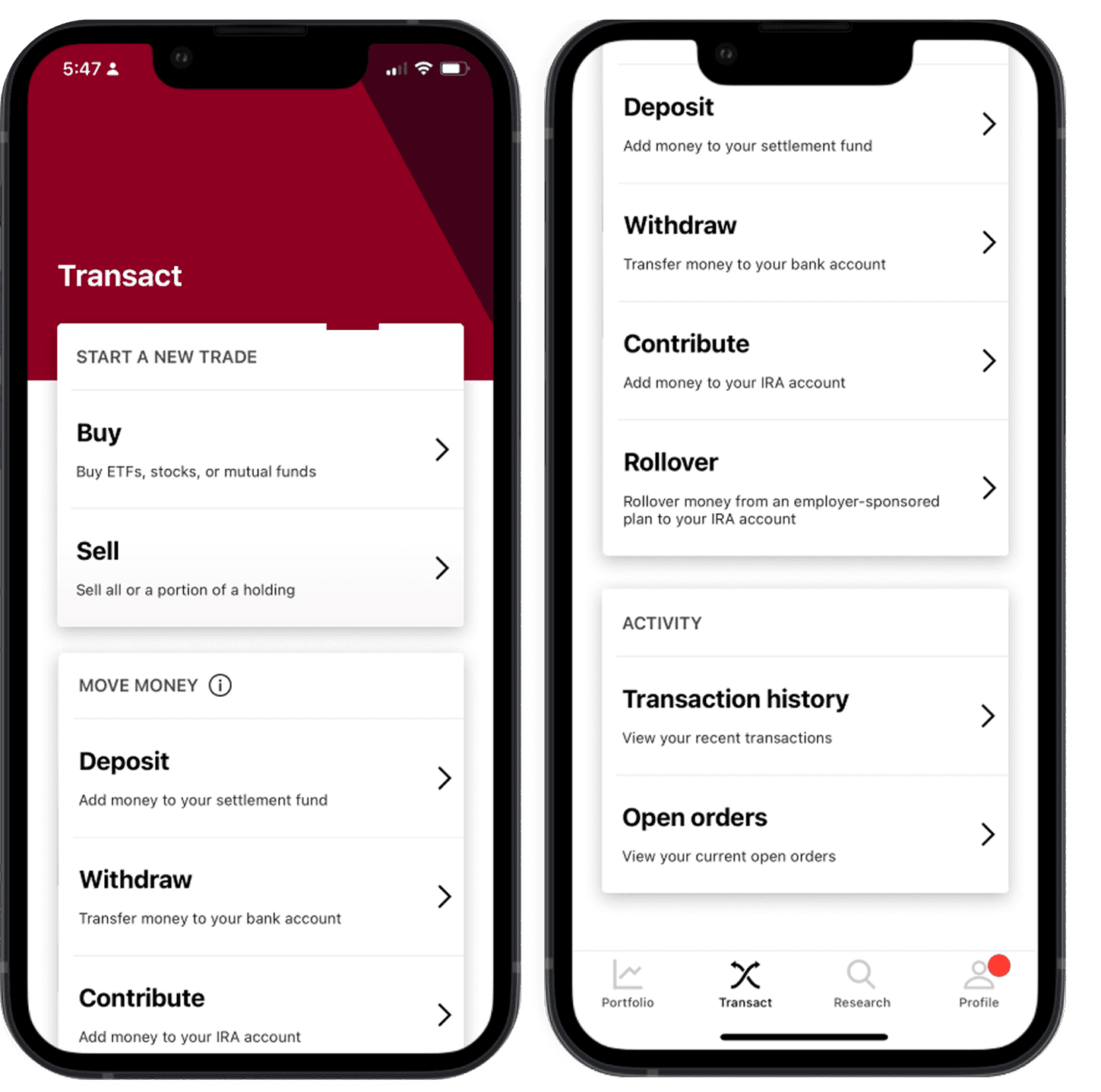 | The four actions moved into an icon-led row. A separate Have a check? callout explained mobile check deposit on the transaction screen, where customers could read it before choosing an action. 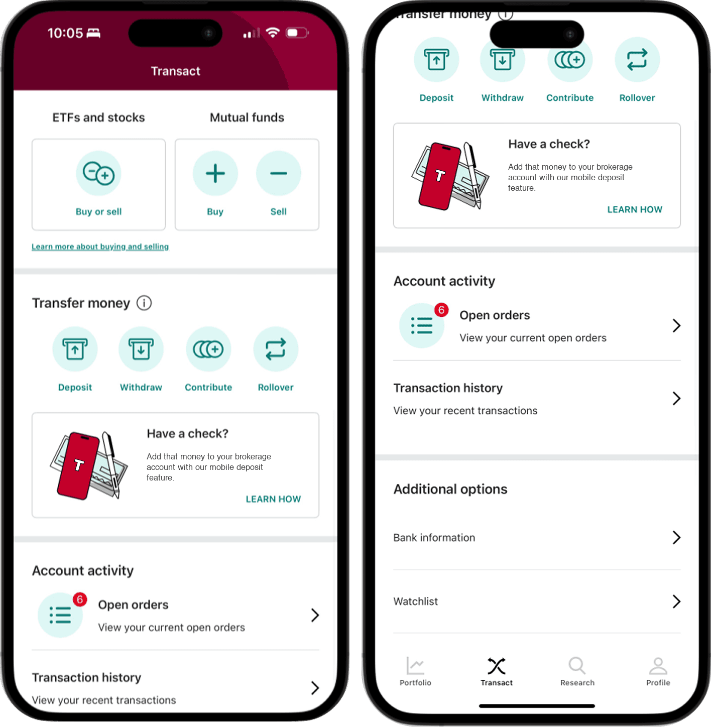 |
Original experience → Design we tested. The tested design grouped related actions and made the check-deposit explanation visible upfront.
Skimmer Takeaway
Let customers start with the task they recognize. Ask them to distinguish between transaction types when the source and destination give them enough context to choose.
Deep Dive
To go deep and learn more about my thinking, judgment, and reasoning expressed on this engagement, continue reading and dive deep.
Est. Reading: 3-5 Minutes
What a Rollover Check Revealed
A customer with a check from a former employer's retirement plan might reasonably think, "I need to deposit this check." In the app, Deposit and Rollover started different flows. The rollover option was farther down the screen, and customers who chose Deposit could encounter an unexpected endorsement prompt. Operations reported that some customers got stuck, left the app, and called for help.

Analytics showed drop-off at the transaction landing page. The operations reports made a specific failure visible further into the flow. A customer could recognize Deposit and still have too little information to tell whether it applied to the check and account in front of them. That made the point where customers chose a transaction worth revisiting.
Mapping Intent to Transaction Rules
I mapped scenarios around what customers were trying to do, where the money came from, and where it needed to go. The customer might describe all three of these scenarios as putting money into an account.
| Source | Destination | Possible transaction |
|---|---|---|
| Bank account | Brokerage account | Deposit |
| Bank account | IRA | Contribution |
| Check from a former employer's retirement plan | Eligible IRA | Rollover |
I used those scenarios to develop wireframes and prototypes. For mobile checks, I advocated for a prominent entry and proposed asking whether the check was a rollover within the flow, once the destination account gave us a reason to ask. That would let the customer start with the check they had in hand. Once they selected a relevant retirement account, the flow could ask about the rollover and explain why the distinction mattered.
1. Start with a mobile check
The customer begins with the check they have in hand.
2. Choose the destination account
Where the money is going sets the context for what comes next.
3. Ask about a rollover when relevant
A short explanation appears only when the destination makes it apply.
Language also needed to work for people who already knew the product. In one review, I pointed out that users had looked for Contribute in testing. That informed the interim wording discussion around Deposit or Contribute and gave the team a reason to keep the familiar term visible in the design options.
Deciding How Much Choice to Show Up Front
One concept gave customers a single Transfer entry and asked where the money should come from and go. That made the landing page simpler, but customers with many accounts could face a long list at the next step. The team explored separate actions that could narrow choices sooner, then use source and destination to guide the customer into the appropriate flow.
Existing transaction forms and limits on how much account context the app could use shaped the near-term options. The team could test clearer starting points on the mobile landing screen while continuing to connect customers to existing flows. More context-aware routing remained a design direction.
What We Tested and What Remained Proposed
The 2023 project readout reports that the team tested a redesigned landing screen. The tested design grouped transaction actions and put mobile check deposit guidance where customers could read it as they decided where to start. The source-and-destination routing illustrated above was a proposed interaction.
The business goals were to improve self-service completion and reduce support calls and correction work. The available project records document the landing-screen test and design direction. Post-release outcomes remain unverified.
Reflection
Mapping the scenarios made it easier to see where the interface was asking customers to make a distinction before they had enough context. In the rollover example, the customer knew they had a check and where they wanted the money to go. Those were better starting points for the design than expecting them to identify the transaction category on the landing page.
Review other case studies

Platform & Ecosystem Transformation
Validating a Faster Path for Policy Testing
How mapping the policy lifecycle exposed an operating-model bottleneck and helped cut one testing cycle from about six months to two weeks.

Service & Workflow Transformation
Shifting Mobile Advice Strategy from Scheduling to Relationship Support
How challenging a desktop-first assumption shaped a phased mobile strategy and helped reduce missed advisor appointments by 35 percent.

Service & Workflow Transformation
Reframing a Mandated CRM Migration Around How Agents Actually Work
How direct agent research exposed a flaw in the platform strategy and led to a household-centered information model.